Full Guide To Mobile Game Design: Theory and Best Practices
A pivotal role in building a successful mobile game plays a well-crafted design. Its quality directly affects the gameplay and user experience. In this article, we find out how to achieve an impeccable mobile game design that would grab players’ attention at first sight.
Mobile Game Design Process
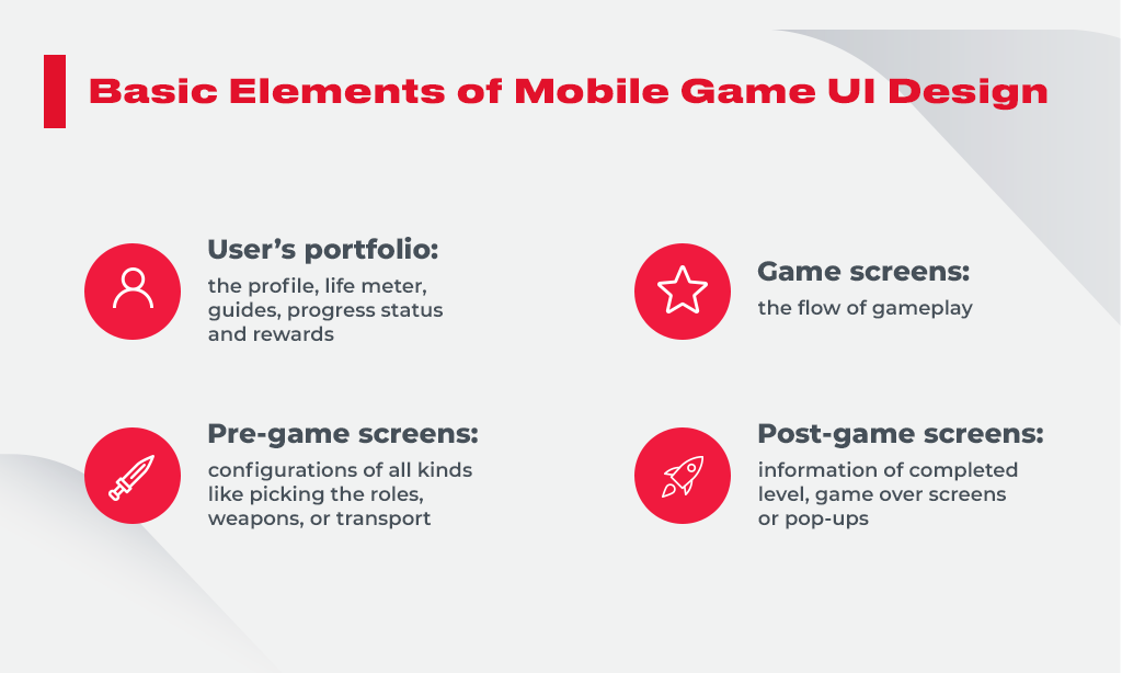
In the game design process, designers and artists are responsible for making games fabulous and aim to provide the top-notch quality of the gameplay, so-called playability. The mobile game design includes the UI (user interface) and the UX (user experience). Mostly, both UI and UX designers develop the style of the entire game, from the colors to typography, widgets, and other interactive elements the players will use.

Ideally, mobile game UI design aims to create flawless and enjoyable gameplay. Users want the game to be easy to understand, intuitive, compelling, and engaging. That’s what makes the design a tricky process. Another challenge for the artists is dealing with a small screen size that implies far less space, unlike in games for PC or tablet. Also, the success of the game UI considerably depends on the UX design. Let’s find out the difference between two game design processes – UI and UX – which are often confused and used interchangeably.
What are UI and UX designs?
Every beginner in the mobile game design must know that mobile game UI design and the UX are not the same things. Essentially, UI is a layout of interface elements, while UX is accountable for how the overall game works and users interact with it.
An exceptional UI artist has in-depth skills in drawing, has an outstanding design aesthetics vision, and knows different techniques on the proper UI functioning. UI artists develop all visual components of the game, including buttons, icons, characters, environments, graphics, and more.

The task of a good UX designer is to research the users’ behavior with the app, create prototypes, conduct testing. So UX designer builds a very detailed interaction and reaction frame that should satisfy players while playing a game.
Mobile Game Design: Best UI and UX Practices
There are many game design principles assisting designers in making quality products. We’ve picked the best tips and ideas for better UI and UX.
1. Do research first
At the beginning of the project, it is crucial to find out who your target audience (TA) is, what their preferences are and how to build such a game that would engage as many users as possible. Some designers fail because of cognitive bias – they think the players will like what they draw without researching the customers’ market. That’s why investigating and understanding the TA is the key to success.
Tips:
- Explore the games and portfolio of your competitors. Finding similar mobile games will help you to design better apps. Consider the elements of the game you like and which ones you don’t appreciate. Apply your knowledge into design practice.
- Define your players to create a user-centered design. Creating personas (portraits of users) of your customers will help you better know their needs, expectations, and how they interact with your game.
- Build super simple prototypes of your ideas to get as much valuable feedback as you can. Process this feedback and iterate your prototypes to finally get the idea that will work for your users.
2. Ensure accessibility to everyone
Designers must keep in mind that the players are different, hence different gaming styles and genres. For example, people can have bad vision, motor and hearing disorders. It is vital to develop your art decisions comprehensively. With a comprehensive approach to design, players with or without impairments will equally enjoy the same game. The image below displays a sample of the text with high contrast for people with low vision.

And here you can see how people with color blindness perceive the interface:

Tip:
Leverage high contrast colors to help people with low sight. Additional icons or elements can aid players with color blindness to understand the content. Besides, make your language concise and short as there could be non-native English speakers among game users.
3. Consider the user distraction
Designers should keep in mind that users are often distracted from games for various reasons – incoming calls, low battery, bad internet connection, and more. The designer’s task here is to think about what the game’s UX should be in this case and how to keep users playing further.
Tip:
For example, some games aren’t closed or paused when somebody calls a player. A small window appears in the upper area of the screen, with two buttons – Accept or Decline the call. This way, the user, not the app or smartphone, decides whether to continue playing or start talking.
4. Add only necessary functions
To design a mobile game interface both beautifully and functionally, UI and UX designers should strive to find the balance between the layout of the game and its features. Trying to add too many options may distract players and turn their experience into horror. Novices to a game may get stuck and don’t know how to start a game, to move further, or even exit it. The most popular games on the market have a particular set of features oriented to aid users in performing only necessary actions.
Tip:
To improve the in-game experience, you need to analyze the most used features and refine them to make the design functional and inconspicuous at a time.
5. Simplify your interface
Cluttered mobile game UI design is usually overwhelmed with excessive information and details. Additional buttons, icons, and text create a mess on the screen. Clutter is a disaster for mobile apps in general, as they have much less space than PC screens. It’s important to remove anything that makes design complicated and confusing for the players.

Tips:
- Create a simple-to-use design for exceptional user experience.
- Prioritize call-to-action buttons – the best is one CTA per screen.
- Avoid filling the screen with unwanted content that adversely impacts user interaction.
- Ensure text, images, icons, and other elements are clear and straightforward.
- Consider leveraging white space wisely.
- Don’t overdo with colors – it will distract the player from the gameplay.
6. Refine in-game navigation
Among other game design principles, the basic one is to fine-tune your in-game navigation. Players should easily navigate through the interface.

Tips:
- Ensure navigation bar, icons and buttons look intuitive to users. Players feel satisfied when they freely navigate through the game.
- Organize the in-game information consistently, so that players perform as few actions as possible to reach the end-point.
- Navigation should assimilate with the overall mobile game UI design and look like a natural part of the in-app content. On the one hand, it must be visible, while on the other, it shouldn’t strike the eye.
- Inform players of their current location to allow them to navigate inside the game seamlessly.
- Ensure your navigation options are always in one place on different screens. If moving them back and forth from place to place, users will get confused and disoriented.
- Provide logical navigation controls from the players’ perspective. This way, they will find what they search for quickly.
7. Locate your UI properly
If taking into account that the majority of mobile games players are right-handed, designers should keep in mind that UI should be adapted considering the clickable areas on the screen. The device may have convenient and hard-to-reach areas:

Tip:
The average human finger pad is 10x14mm, and the average fingertip is 8-10mm, which makes 10x10mm a sufficient minimum for defining touch target size. So try to remember these figures when designing your UI.
8. Give feedback on users’ actions
In a perfect gaming world, objects react to our actions. Even the imaginary world of games should do the same. Players expect that UI elements respond to their activities. The goal of designers is to ensure that the user receives feedback after acting.
In case the game elements don’t give feedback, the player may be puzzled about whether the touch target is frozen or if it was a miss-click.

Tip:
The response to a user’s action can be physical such as vibration or visual such as highlighting a tapped button or changing its color tint.
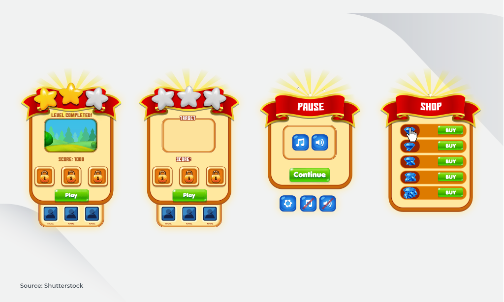
9. Use pop-up windows wisely
Pop-up is a functional game component used to communicate additional information to players. Here are some practical tips for using pop-ups accurately:
- Connect the visible part of UI with the invisible one using animations: after the player clicks on the element causing a pop-up, animate the window’s launch. For example, enlarge it when it opens, and minimize the window into a button after closing. This will help users better understand the origin of a pop-up.

- Put under the pop-ups a visible but a little darkened background. Since popping up windows imply a user(s) must take action, this allows them to know that the game is on pause, but they can be back anytime. The dark background should appear with the pop-up opening and vanish after the animation is closed simultaneously.
- Use the X symbol accurately. This symbol is fine when used as part of a pop-up art asset. It’s prominent, has good sizing and color contrast. It works perfectly fine for closing windows no matter if they are valuable or regular. On the other hand, the X symbol shouldn’t be done like one for an add. It’s usually small and hidden from a user to prevent him from closing the ad.
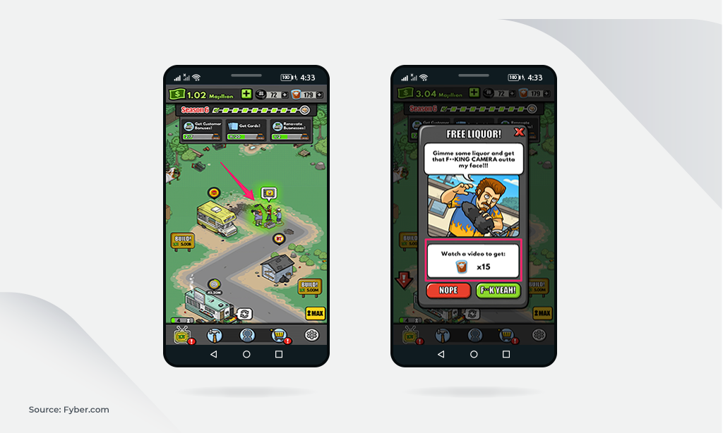
10. Get the most out of in-game ads
Reward videos have become the industry-leading ads as part of the free-to-play mobile games. They are beneficial for both users who agree to watch commercials and publishers who get incomes from in-game purchases.

Tip: Game designers should carefully think over the appearance, duration, and frequency of the ads as well. Plus, the rewards after watching videos must be valuable for players. Otherwise, they will skip or ignore such advertisements.
11. Always test your creations
Typically, even a visually perfect and thoughtful design will reveal its invisible imperfections when put into production. A design usually looks perfect at the artist’s big screen, but it doesn’t look the same on the user’s smartphone. That’s why it’s crucial to test the game with real players on various devices to ensure it surpasses all expectations.
Tips:
- Ask real players to complete your game. Based on the data of testing, you’ll notice the unseen flaws in the design.
- Always do a comprehensive assessment of your game. Improve the gameplay using gathered analytics and users’ ratings.
Conclusion: Successful Mobile Game Design with Innovecs
Great design is a balance of visually interesting interface, pleasant experience, and functionality. This is exactly what artists should be aiming for when designing a game. The first attempt to create an ideal application may fail and it is quite a normal thing. Treat your mobile game as a regularly evolving app, that needs to be refined, upgraded, and improved. The following recommendations may help create an exceptionally good design.
- Explore your users to make the game hit the target.
- Avoid unnecessary features that distract users’ attention.
- Keep the interface simple and clear.
- Create a UI accessible to everyone.
- Gather players’ feedback to refine the game.
- Test your design, iterate, and repeat.
Creating an entertaining game from scratch is a challenging task as well as improving the existing one. The solution is outsourcing game design and getting your next hit on time and on budget with the help of Innovecs’ game experts. We’ve got proprietary mobile game design software allowing us to implement new features focused on retention and monetization.